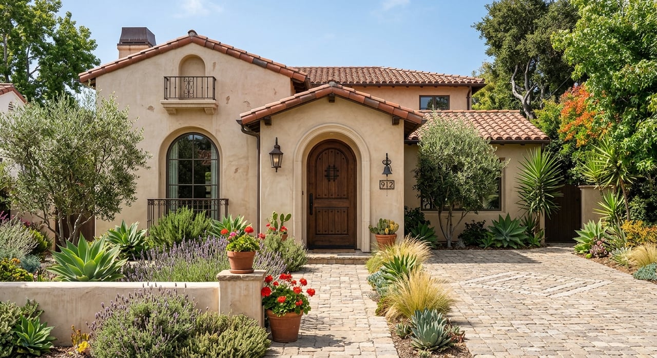
Color is more than a visual detail; it's an experience that shapes your mood, energy, and even your daily productivity. Choosing paint tones for your home isn't just about matching décor or staying on trend. It's about setting the tone for how you want to feel in your space. The right colors can open up a room, create calm, encourage focus, or spark creativity.
Whether you're planning a full renovation or a simple refresh, understanding the science of color will help you make thoughtful choices that reflect your lifestyle and elevate every corner of your Thousand Oaks home.
Start With How You Want Each Room To Feel
Before exploring color swatches, think about what you want to feel when you walk into a room. Do you want your living room to be lively and energetic or relaxed and comforting? Should your bedroom feel restful and serene or luxurious and dramatic? Color psychology gives us clues about how different hues affect our minds. Warm colors like reds, oranges, and yellows bring energy and warmth, while cool tones — such as blues, greens, and purples — tend to calm and soothe.
This doesn’t mean you’re limited to specific palettes, but it helps to align your choices with your goals for the space. For instance, if your dining room is a place where you want guests to linger and engage, you might lean toward warmer, richer tones. If you need mental clarity in the office, lighter neutrals or cool greens could promote better concentration.
This doesn’t mean you’re limited to specific palettes, but it helps to align your choices with your goals for the space. For instance, if your dining room is a place where you want guests to linger and engage, you might lean toward warmer, richer tones. If you need mental clarity in the office, lighter neutrals or cool greens could promote better concentration.
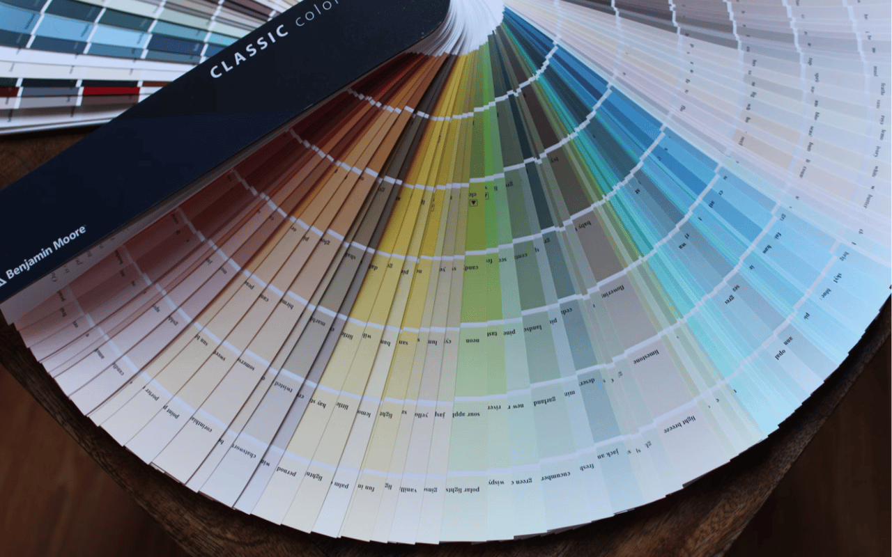
Understand Undertones And Natural Light
Choosing the right paint tone isn’t just about the base color — the undertone plays an equally important role. An undertone is the subtle hue underneath the main color that can make a shade feel warmer, cooler, or more neutral. Two grays can look completely different, especially if one has a blue undertone and the other leans brown.
Natural light also shifts how a color appears. A soft beige in the paint store might turn yellow in a room with bright southern exposure or grayish in a space with little daylight. Always test your chosen paint tones on several walls and observe how the color shifts throughout the day. This is especially important for large, open areas or rooms with varied lighting conditions. Artificial light sources can also influence how the paint looks, so evaluate your color swatches at night as well.
Natural light also shifts how a color appears. A soft beige in the paint store might turn yellow in a room with bright southern exposure or grayish in a space with little daylight. Always test your chosen paint tones on several walls and observe how the color shifts throughout the day. This is especially important for large, open areas or rooms with varied lighting conditions. Artificial light sources can also influence how the paint looks, so evaluate your color swatches at night as well.
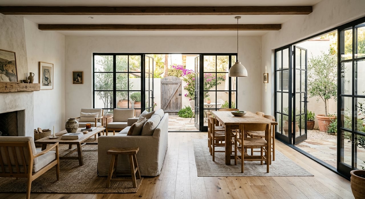
Choosing Paint For Your Living Room
The living room often serves as a central gathering space, making it a great place to use colors that feel welcoming and expressive. Earthy tones, like warm taupes, soft browns, muted greens, or clay-inspired shades, tend to create a grounded, comfortable vibe. If your living room has oversized windows and lots of natural light, you can go a bit bolder — deeper navy, olive, or even charcoal can feel dramatic without overwhelming.
If you're working with a compact or darker space, light and airy hues can help expand the feel of the room. Try warm whites, creamy ivories, or subtle greiges. These tones offer flexibility, allowing you to incorporate different textures, accent colors, and décor styles over the years without needing to repaint.
If you're working with a compact or darker space, light and airy hues can help expand the feel of the room. Try warm whites, creamy ivories, or subtle greiges. These tones offer flexibility, allowing you to incorporate different textures, accent colors, and décor styles over the years without needing to repaint.
Colors For The Kitchen
Kitchens thrive on energy and brightness, which is why so many people gravitate toward whites, pale blues, or light sage greens. These shades reflect light, help your space feel clean and open, and work well with both modern and traditional finishes. If you want something more playful, soft yellows or blushes add warmth without becoming overpowering.
If you have darker cabinetry or limited natural light, avoid overly cool colors, which can make the space feel colder. Instead, explore warmer neutrals with creamy undertones or gentle terracottas for a touch of earthiness. Accent walls in more saturated colors like navy or deep teal can also provide visual interest without overwhelming the entire room.
If you have darker cabinetry or limited natural light, avoid overly cool colors, which can make the space feel colder. Instead, explore warmer neutrals with creamy undertones or gentle terracottas for a touch of earthiness. Accent walls in more saturated colors like navy or deep teal can also provide visual interest without overwhelming the entire room.
Bedroom Tones That Promote Rest
Your bedroom should be your personal sanctuary — a space where your body and mind can unwind. Cool tones are typically the most restful, so consider soft blues, lavenders, or pale greens if you’re aiming for tranquility. Lighter shades of gray with subtle undertones can also provide a soothing, modern look, especially when paired with rich fabrics or warm wood tones.
If you're looking for a more dramatic aesthetic, deep plum, charcoal, or even rich navy can create a refined ambiance — just be sure to balance these darker hues with lighter bedding, curtains, or trim to keep the room from feeling too heavy.
If you're looking for a more dramatic aesthetic, deep plum, charcoal, or even rich navy can create a refined ambiance — just be sure to balance these darker hues with lighter bedding, curtains, or trim to keep the room from feeling too heavy.
Calm, Creative Colors For Your Home Office
In a home office, your paint choices should encourage focus and productivity but also support your creativity. Blues and greens are top choices for this reason. Soft blue-greens promote calm, mental focus, and balance, which can help you stay grounded during busy workdays. If you’re in a creative profession, consider bolder shades like teal, burnt orange, or even a muted mustard for inspiration.
Neutral tones like sand, stone, or beige also work well, especially if you're using lots of artwork or office accessories that you want to stand out. A pale color on the walls provides a calming canvas, letting your personality and workflow tools shine without visual clutter.
Neutral tones like sand, stone, or beige also work well, especially if you're using lots of artwork or office accessories that you want to stand out. A pale color on the walls provides a calming canvas, letting your personality and workflow tools shine without visual clutter.
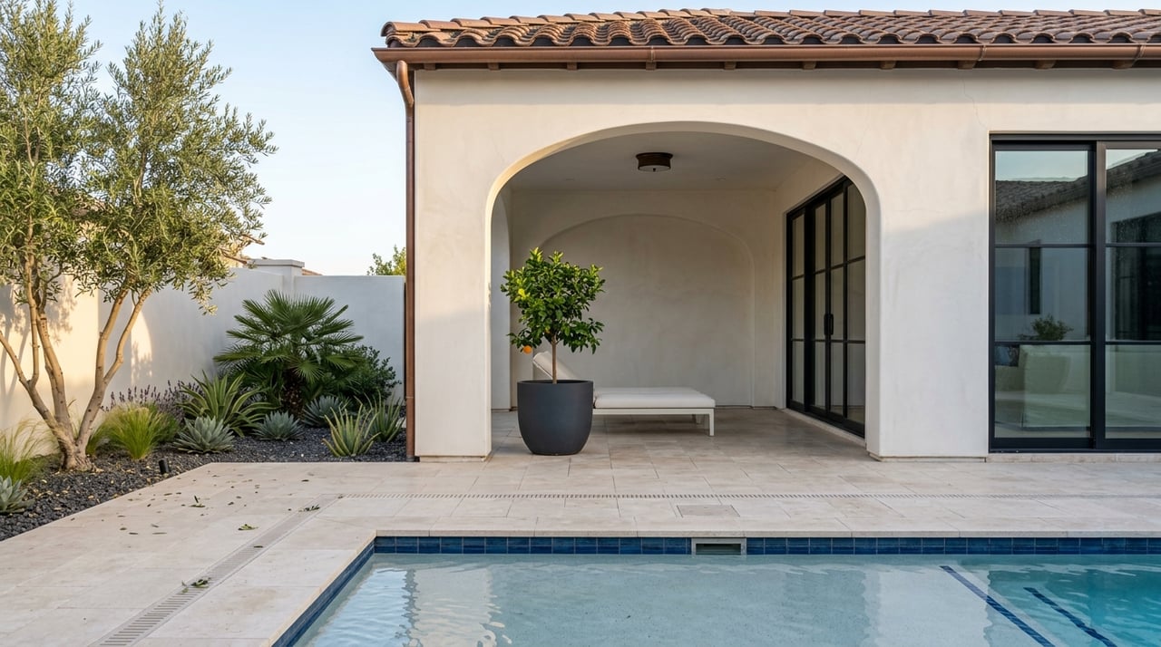
Paint Ideas For Bathrooms
Bathrooms offer a great opportunity to play with color, especially if they’re smaller in size. Because these spaces are often used as a quick retreat or a refresh zone, light and clean tones can feel especially rejuvenating. Soft aquas, dusty blues, warm whites, and cool grays can all evoke a spa-inspired atmosphere.
In a powder room, where you don’t spend long periods of time, you can afford to go a little bolder. A deep green, warm charcoal, or rich jewel tone can turn a small space into a design-forward statement. Use lighting and reflective materials like mirrors or tile to help balance darker tones and keep the space feeling open.
In a powder room, where you don’t spend long periods of time, you can afford to go a little bolder. A deep green, warm charcoal, or rich jewel tone can turn a small space into a design-forward statement. Use lighting and reflective materials like mirrors or tile to help balance darker tones and keep the space feeling open.
Accent Walls And Color Zoning
If you’re not ready to commit to painting an entire room, accent walls can add dimension and visual interest with minimal effort. A bold color behind a headboard, sofa, or desk can anchor a space and make a standout design statement. Accent walls are also a clever way to zone a space — especially helpful in open floor plans where you want to define separate functions like a dining area, reading nook, or workspace.
Color zoning doesn’t have to be limited to solid blocks. Painted arches, half-walls, or color-blocked shapes can create subtle transitions between areas without physical dividers. Choose tones that complement the rest of your palette while offering contrast — this makes the feature feel intentional and cohesive.
Color zoning doesn’t have to be limited to solid blocks. Painted arches, half-walls, or color-blocked shapes can create subtle transitions between areas without physical dividers. Choose tones that complement the rest of your palette while offering contrast — this makes the feature feel intentional and cohesive.
Don’t Ignore The Ceiling
The ceiling, often called the “fifth wall,” can dramatically influence a room’s atmosphere. Painting it a crisp white can help reflect light and make the room feel taller, but if you're looking to make a design statement or cozy up the space, consider going bold.
A painted ceiling in a rich hue, like moody navy, smoky plum, or warm terracotta, adds drama and depth — especially in rooms with crown molding or architectural detail. Lighter tints of your wall color on the ceiling can also create a sense of softness and cohesion without breaking the flow.
A painted ceiling in a rich hue, like moody navy, smoky plum, or warm terracotta, adds drama and depth — especially in rooms with crown molding or architectural detail. Lighter tints of your wall color on the ceiling can also create a sense of softness and cohesion without breaking the flow.
A Cohesive Color Strategy For Your Whole Home
While each room can have its own mood, it’s still important to create a flow throughout your home. Choose a consistent base color or undertone that can carry through shared spaces like hallways or entryways. From there, build a palette of coordinating hues that complement one another — this way, your transitions between rooms feel natural rather than jarring.
You can also unify your home’s look by repeating accent colors through furniture, textiles, or art. Even if each room has a distinct personality, these small touches keep your home feeling intentional and well-balanced.
You can also unify your home’s look by repeating accent colors through furniture, textiles, or art. Even if each room has a distinct personality, these small touches keep your home feeling intentional and well-balanced.
Color Can Transform How You Live
With the right paint tones, you can make a small room feel expansive, create warmth in a cold space, or give a modern edge to a classic residence. Use the science of color to guide you, but don’t be afraid to take creative risks. Trust your instincts, experiment, and most importantly, choose colors that make you feel at home in your space.
And, if you’re ready to find the right home in Thousand Oaks or achieve a winning sale, connect with the Madge & Hamilton Group for trusted guidance.
And, if you’re ready to find the right home in Thousand Oaks or achieve a winning sale, connect with the Madge & Hamilton Group for trusted guidance.